· Dinesh Gajjar · Insights · 7 min read
The Colour We Earned
Good software should guide the person holding it, not wait to be figured out
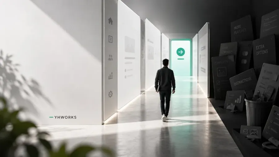
There is a moment I have watched unfold hundreds of times across the last two decades. We place a product we have built into someone’s hands, and they simply begin to use it. There is no walkthrough. There is no training call. There is no thick manual lying unopened in a drawer. The person picks it up, and the application quietly leads them to whatever they need to do next.
To the person using it, that moment feels effortless. For the teams who build it, that moment is the hardest thing we do.
My belief has stayed unchanged for a long time. A layman should be able to use good software the moment it is in their hands. The flow itself should do the explaining. The application should guide the user forward, rather than leaving the user to reverse-engineer what the builder was thinking. Most software fails this quiet test not because it does too little, but because it insists on doing too much. Every additional toggle, every speculative feature, every idea that begins with “would it not be nice if” places a small tax on the person who is only trying to finish their work. Stack enough of those small taxes on top of one another, and what remains is a product that is technically capable and practically exhausting.
Where this belief was quietly seeded
I did not arrive at any of this on my own, and I should be honest about where the belief was first planted.
Years ago, when I was still in a job, my superior Makrand Karkare handed me a book titled “The Design of Everyday Things” by Don Norman. I did read it as a novice software engineer. Yet a few things in it struck me and never left. Norman argues, in essence, that when a person cannot work out how to use a thing, the fault does not lie with the person. It lies with a design that failed to guide them. That single idea reorganised how I looked at everything I built.
Some years later I had the good fortune of working with a client who was himself a design engineer, and who had attended a workshop conducted by Don Norman. We would often fall into long discussions about these principles, and I learned a great deal from him about design in a way that no book alone could have taught me. Those conversations did not hand me any new belief. They took the belief that was already quietly forming and gave it weight, direction, and conviction.
I want to be clear that I do not consider myself an expert, and I make no claim to a strong forte in user interface design. What I do have now is genuine experience, gathered patiently over the years, and a standing intent that never switches off. With every product, I attempt to make the interface a little better than it needed to be. That accumulated effort, more than any single stroke of talent, is what has slowly translated into software that people find easy and pleasant to use.
A decision we made, and then held on to
It is easy to praise restraint in the abstract, so let me offer something real from our own work.
Six months ago we released a product built entirely in black, white, and grey. There were no accent colours. There was no brand palette competing for attention. Hierarchy came from spacing, from weight, from contrast, and never from a scatter of colourful buttons each demanding to be tapped first.
That was a deliberate choice, and I will admit it was not an easy one to defend in the early conversations. Colour is tempting. Colour makes a screen look considered and finished. Everyone quietly expects it to be there. Colour is also the fastest way to introduce noise into an interface, to signal ten things at once until the person can no longer tell which one actually matters. We wanted the flow itself to carry the person through, so we removed everything that might distract from that flow, and we allowed the structure of the product to do the guiding.
We lived with that discipline in the market for a full six months. We watched real people move through the product. We noted where they paused, where they hesitated, and where they moved with confidence. Only in our August release did we introduce colour, and even then it arrived as a single, very subtle accent, placed exactly where it earns its keep, drawing the eye toward the one action that matters most on a given screen.
That single decision holds the whole philosophy inside it. Colour was not withheld as an exercise in minimalism for its own sake, and it was not added because a release calendar asked for something new. It was earned. It arrived only once we understood, from watching genuine everyday usage, precisely where a gentle nudge would help a person and where it would have been mere decoration. The restraint came first. The addition came afterward, and it came with a reason.
Knowing what to leave out is the real expertise
Anyone is capable of adding a feature. The pressure to add is relentless and it never truly stops. A client mentions something in passing. A competitor ships a shiny new button. Someone on the team arrives with a clever idea worth admiring. Saying yes to all of it feels like progress, and that is exactly why it is dangerous.
More than twenty years in this field, going back to the earliest days of the iOS SDK, have taught me that the harder and far more valuable discipline is the well-considered refusal. Understanding what a person genuinely needs on an ordinary Tuesday afternoon, when they are busy and distracted and simply want the task done, and then holding the restraint to build only that, is a judgement that does not arrive from a framework or a checklist. It arrives from having watched, again and again across many products and many users, what quietly works and what quietly fails.
Some of the most respected engineering organisations in the world have learned the same lesson at a scale most of us will never operate at. Mercedes-Benz once identified and removed around six hundred non-essential features from their cars after those features caused malfunctions and drew customer complaints. NASA has long listed excessive features among the leading risks that quietly sink development projects. A large part of good engineering, it turns out, is the discipline of deciding what should never be built in the first place.
The quiet takeaway
If the people using your product need a manual to begin, then the design has not yet finished its work. The goal was never a product capable of doing everything. The goal is a product that does the right things, that guides people through them naturally, and that then steps out of the way.
Build less, but build the right less. That restraint, and not the count of features or the brightness of the palette, is what separates the software people merely tolerate from the software people quietly come to trust.
If This Sounds Like Your Team
If you have ever handed a piece of software to your users and watched them struggle — reaching for a manual, hunting through menus, asking what to click next — the problem is rarely them. It is the design.
We build software that guides the person holding it: simple to pick up, honest about what it does, and free of the clutter that no one asked for. Not over-developed. Just right.
If that is the kind of product you want to put in front of your users, we would genuinely like to show you what we mean. Book a consultation with one of our founders. We would be glad to walk you through how we think, and how it could fit your organization.
We build the way we do because we believe restraint is a feature. We would be glad to help you build the same way.